
本页目录
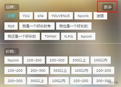
筛选是一个很强大的功能,可以帮助方更快速的从多个维度出发,找到自己需要的内容。但是,随着网站内容的越来越多,标签越来越多,在 PC 端还好,在移动端就难受了。
因此,可以在移动端给 B2 的筛选添加一个更多按钮,点击更多按钮之前,只显示部分内容,点击按钮后,显示全部内容。
思路
通过 css 强制所有的筛选同时显示,如下图:
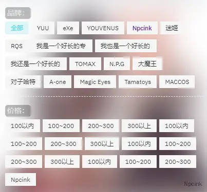
这样又太多了,挤在一起,不好看,可以设置一股固定的高度,让他们只显示三行,加上一个按钮,点击后展开全部,例如这样:
部署:
筛选的相关代码在这个文件中:
Modules/Templates/Archive.php找到第 57 行的 ul 标签,
修改前: <ul>';修改后:<ul id="n-open">';找到第 215 行的代码,
return '<li><div class="filter-name">'.__('专题','b2').':</div><div class="filter-items">'.$a.'</div></li>';修改为:
return '<li><div class="filter-name">'.__('品牌:','b2').'</div> <span class="n-class" onclick="openTwo()">更多</span> <div class="filter-items">'.$a.'</div></li>';在 Archive.php 文件的底部的<?php前添加以下 CSS 和 JS 代码:
<style type="text/css">
/*筛选优化*/
/*PC端隐藏更多按钮*/.n-class { display: none;}@media screen and (max-width: 768px) { /*磨砂背景*/ .tax-header .wrapper { position: initial; }
/*隐藏多余信息*/ .tax-header .tax-info { display: none; } .waves-bg { display: none; } /*强制显示*/ .tax-fliter-cat { display: block !important; top: 0px; position: inherit; } .filter-items { white-space: inherit; height: auto; }
/*文本美化*/ .filter-name { color: #f5f5f5c7; width: auto; background-color: #00000042; border-radius: 5px; padding: 2px 4px; }
/*显示更多按钮*/ .n-class { display: block; position: absolute; right: 2em; color: #f5f5f5c7; width: auto; background-color: #00000042; border-radius: 5px; padding: 2px 4px; }
/*固定高度*/ .filter-items { height: 100px; }
/*自适应高度*/ .n-open .filter-items { height: auto; }
/*隐藏更多按钮*/ .n-open .n-class { display: none; }}
</style>
<script type="text/javascript">function openTwo() {document.getElementById('n-open').className = 'n-open';}</script>保存代码后即可完成部署。达到上图所示效果。