
本页目录
得益于现代化的 CSS 进步,以前进行瀑布流布局还需要用到 JS,现在纯 CSS 就能实现瀑布流布局了,一起来看看吧。
CSS Grid和Flexbox让我们可以更简便,更容易和更快的实现各式各样的响应布局,并且让我们快捷方便的在布局中实现横向剧中和竖向剧中。但是回想一下以前是颇为困难的。
虽然这些新出的布局方式可以让我们解决很多以前的布局难题,但是像瀑布流布局这种,就无法用它们简单来实现了。因为瀑布流一般来说都是宽度一致,但是高度是根据图片自适应的。并且图片的位置也是根据在上方图片的位置而定的。
其实最好实现瀑布流布局的办法就是用 CSS 的列属性套件,这套属性大多数都是用于排版杂志中的文本列。但是用于布局瀑布流也是特别实用哦。因为以前需要实现瀑布流,就必须有 JavaScript 的辅助来计算图片高度然后决定每张图片的定位和位置,所以现在有了列属性就可以使用纯 CSS 实现了。
- 代码来源:详情
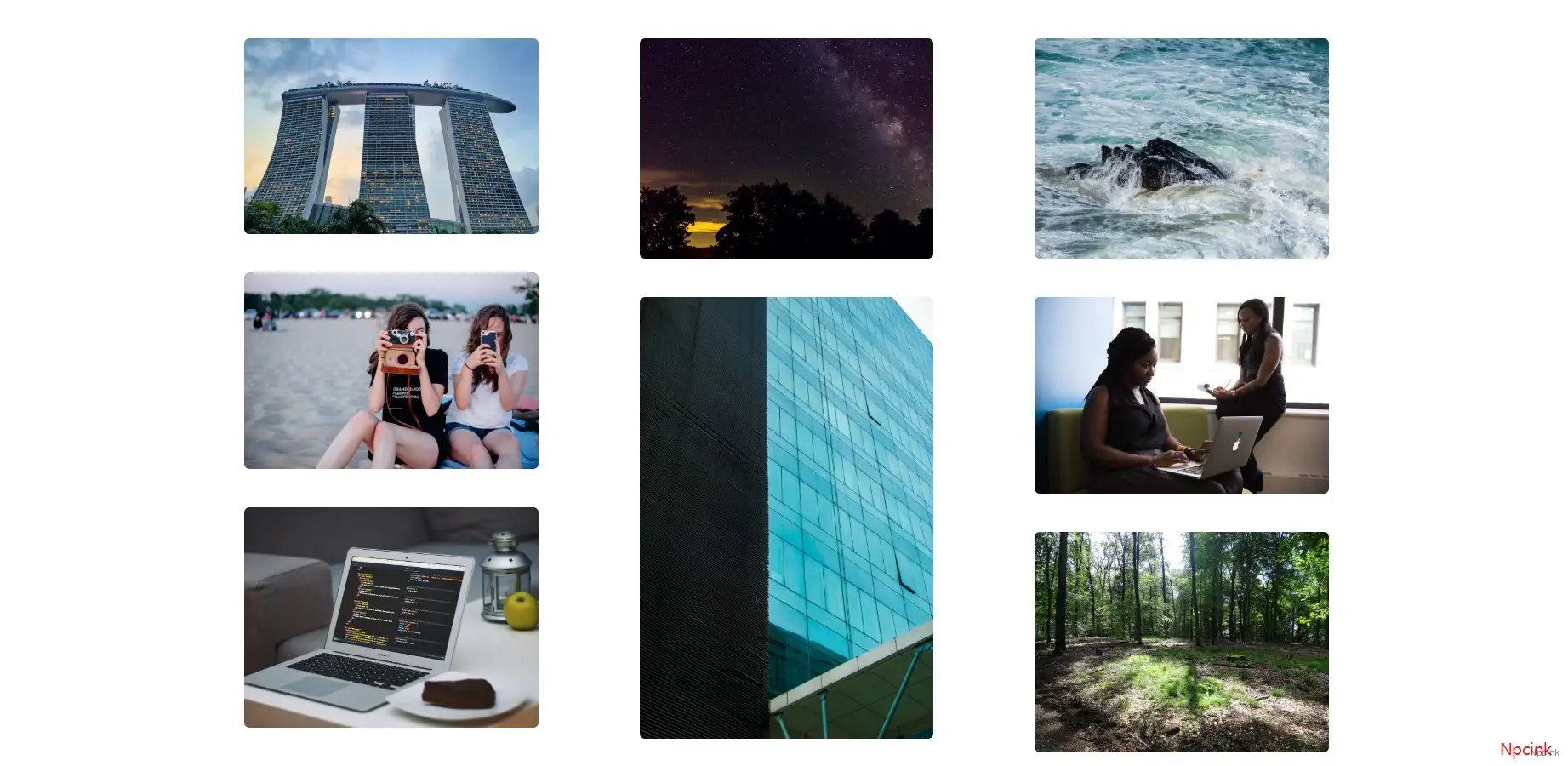
实现原理:
实现这个布局,首选我们需要把所有的内容先包裹在一个div元素里面,然后给这个元素column-width和column-gap属性。
然后,为了防止任何元素被分割到两个列之间,将column-break-inside: avoid添加到各个元素中。
神奇的效果就完美实现了,零 JavaScript。
我们来看看代码:
<div class="columns"> <figure> <img src="https://source.unsplash.com/random?city" alt="" /> </figure> <figure> <img src="https://source.unsplash.com/random?night" alt="" /> </figure> <figure> <img src="https://source.unsplash.com/random?developer" alt="" /> </figure> <figure> <img src="https://source.unsplash.com/random?building" alt="" /> </figure> <figure> <img src="https://source.unsplash.com/random?water" alt="" /> </figure> <figure> <img src="https://source.unsplash.com/random?coding" alt="" /> </figure> <figure> <img src="https://source.unsplash.com/random?stars" alt="" /> </figure> <figure> <img src="https://source.unsplash.com/random?forest" alt="" /> </figure> <figure> <img src="https://source.unsplash.com/random?girls" alt="" /> </figure> <figure> <img src="https://source.unsplash.com/random?working" alt="" /> </figure></div>.columns { column-width: 320px; column-gap: 15px; width: 90%; max-width: 1100px; margin: 50px auto;}.columns figure { display: inline-block; box-shadow: 0 1px 2px rgba(34, 25, 25, 0.4); column-break-inside: avoid; border-radius: 8px;}.columns figure img { width: 100%; height: auto; margin-bottom: 15px; border-radius: 8px;}知识总结
- column-width — CSS 属性建议一个最佳列宽。 列宽是在添加另一列之前列将成为最大宽度。
- column-width — 该 CSS 属性用来设置元素列之间的间隔 (gutter) 大小。
- column-break-inside — 设置或检索对象内部是否断。